See the Pen Lyelc by Simon Attley (@sattley) on CodePen.
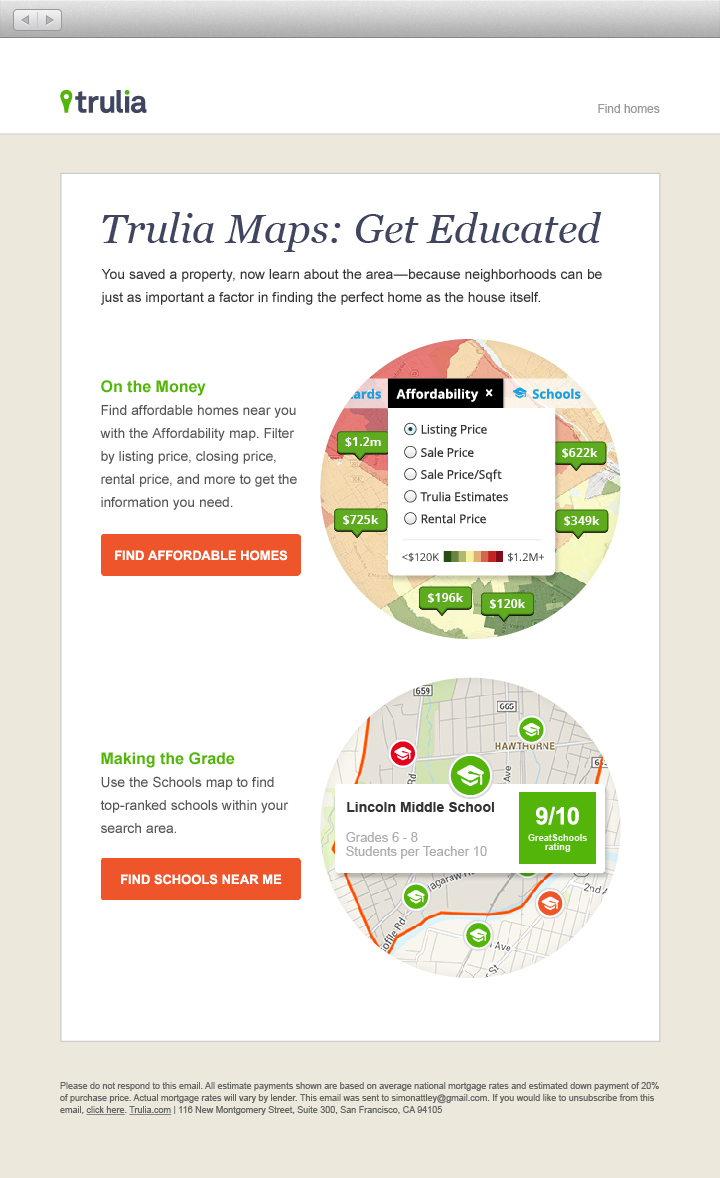
As a Contract Visual Designer at Trulia I was tasked with designing and developing responsive emails. This particular email was to tout the maps features that Trulia.com offers. Email development is a tricky but rewarding experience in that they are decidedly lo-tech in that old fashioned table based HTML is used to code them. However given that a majority of emails are opened on mobile devices these days, as opposed to desktop devices, the need for a responsive solution is of tantamount importance – this is where the coding challenge comes in 
HTML Email Coding Tips
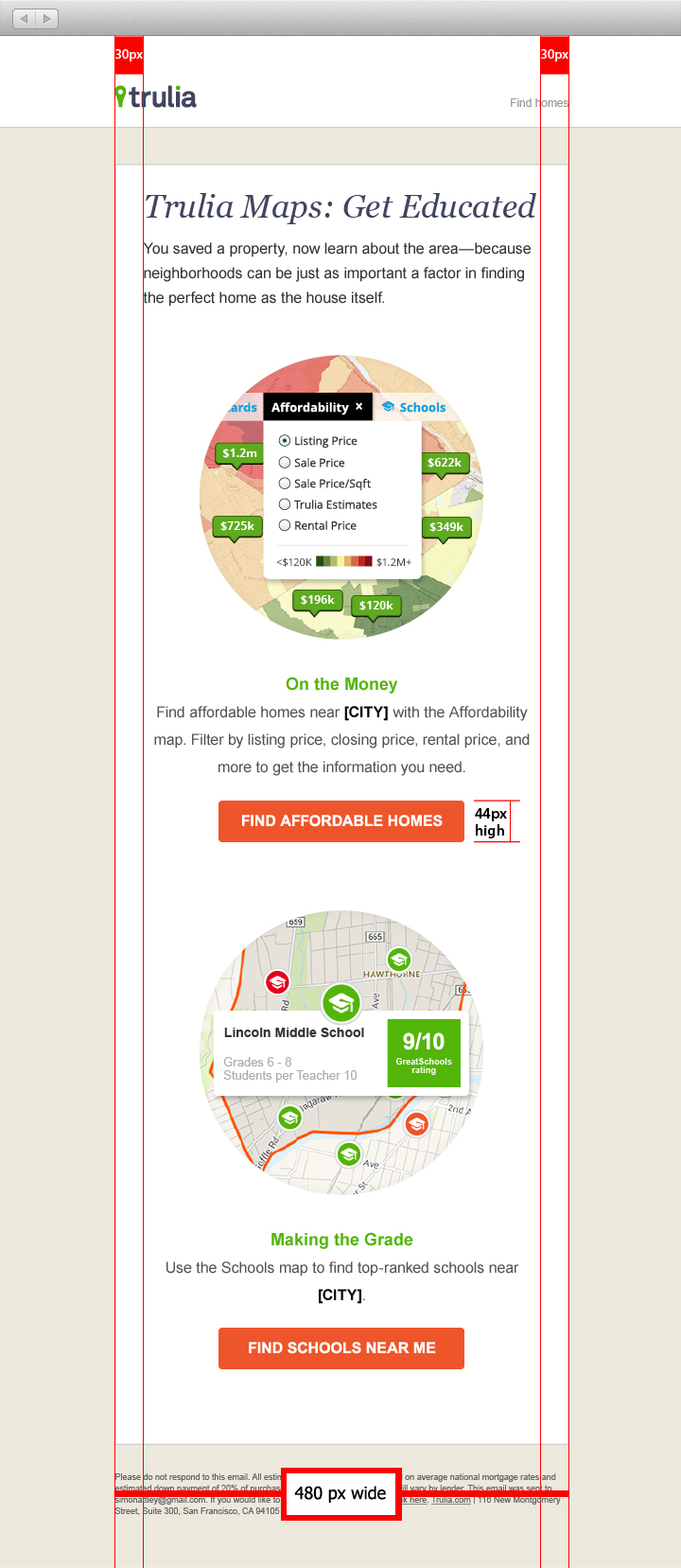
- Single-column layouts no wider than 500 to 600 pixels work best on mobile devices as they’re easier to read and degrade gracefully.
- Links and buttons should have a minimum target area of 44 × 44 pixels, as per Apple guidelines.
- The minimum font size displayed on iPhones is 13 pixels. Keep this in mind when styling text.
- More than ever, keep your message concise, and place all important design elements in the upper portion of the email. Scrolling is often more laborious on a touchscreen than with a mouse.
- When possible, use display: none; to hide extraneous details in your mobile layout.
- When possible use full HTML table syntax and when using CSS – use it inline and do not use shorthand CSS.
- Use alt tags in all relevant imagery.
- Last but not least, test, test and then test again.